

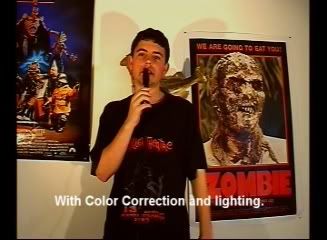
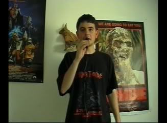
I did a color correction test please comment on what you think should be better, or general thoughts.
- YouTube
It doesn’t help that they both have different aspect ratios. They need to have the same to properly compare them.
I think there is too much green in the corrected version, it makes it look more unnatural. The sky looks green instead of blue. The red on the cone is too vibrant that the colour almost bleeds out.
[quote=“Ify”]
It doesn’t help that they both have different aspect ratios. They need to have the same to properly compare them.
I think there is too much green in the corrected version, it makes it look more unnatural. The sky looks green instead of blue. The red on the cone is too vibrant that the colour almost bleeds out.
[/quote]
Thanks alot i thought the same, it was my first test, also i forgot to mention i was comparing aspect ratio also. I will have my second attempt up probably tonight, but thanks for the feedback, i was going for the green stylized look of it but i understand what you where saying it was a little too green.
I kinda like the second test, even though it could be much improved with better colour coordination. But it gives your scene a more professional look to it, as opposed to an amateur “home video” look.
not meaning to be harsh dude…
but you have alot to learn man.
the color correction was pretty terrible your “green stuff” looked like piss…and your lighting was just disgusting. and you’re “aspect ratio” shots? Those were just stretched versions of your full-screen shots…thats not right. it makes the shot all squished. does that look right to you? just wondering.
keep trying. learn from your mistakes.
again not trying to be a jerk, but these things were just glaringly wrong to me so i thought i should mention something.
some lighting tips? i am insanely illiterate when it comes to lighting. YEa the aspect ratio was fucked up cause i rushed it, if you check my other videos on youtube under my account the aspect ratio is not like that, but when played on a tv screen it does not looked squashed.
Yeah, I’d have to say I liked the un-tampered with shots the best. The lighting changes
kinda just look like you took the shade off a lamp and set it on the floor in front of you.
it was lite with tungsten from to different angles.
i would have to say, that compared side to side.
That the first looks a whole lot better.
im just going to keep at this until i get it right, here is another one. - YouTube
and for comparison
just to clarify…what’s the point for doing this?
for my new up coming film i want a different look to it, different than the others, clearer. PLus above imo the colors look better between the two the corrected on looks better.
Is the color correction something you plan on using all the time or just for
one specific movie? I ask because the “correction” looks very un-natural.
The colors are so much more vibrant then they are in real life, which would
work if your going for a more surreal style of movie. But, I’d stay away from
it if you’re going for gritty and real.
yea this film is going to unnatural almost in the style of a tales from the crypt dc comic book.
[quote=“Bluesteel”]
not meaning to be harsh dude…
but you have alot to learn man.
the color correction was pretty terrible your “green stuff” looked like piss…and your lighting was just disgusting. and you’re “aspect ratio” shots? Those were just stretched versions of your full-screen shots…thats not right. it makes the shot all squished. does that look right to you? just wondering.
keep trying. learn from your mistakes.
again not trying to be a jerk, but these things were just glaringly wrong to me so i thought i should mention something.
[/quote]
Jjp, it’s up to you how you want your color to look like when you shoot it. If you are directing this, you are responsible for the look and feel of the movie. So with that being said, depending on the color or light setting you use will describe the mood for the scene you are trying to shoot. Listening to people like this will make you obsess over nothing. -In fact don’t listen to people like this.
If you want my opinion… Shooting for “Obscure Movie Review”, I’d use the extra light setting as you see here:
If I were shooting for a horror movie, I’d probably keep it a little darker; depending on scene of course.
It’s all based upon your opinion, and what you have in mind for the shot.
i wasn’t trying to insult him. sorry if it came off that way. i was just merely saying that it looked pretty terrible. people need to learn from their mistakes.
but you are absolutely right ThaDuke, its his film and he’s entitled to do whatever he wants. well said.
[quote=“Bluesteel”]
i wasn’t trying to insult him. sorry if it came off that way. i was just merely saying that it looked pretty terrible. people need to learn from their mistakes.
but you are absolutely right ThaDuke, its his film and he’s entitled to do whatever he wants. well said.
[/quote]
Wow, I love how you handled that. Well done, dude. 
i mean the lighting itself, was lit normal two lights from opposite angles for a review show, simple. i don’t have the money for a light above me, and the lighting does not look so well youtube. PLus im using outdated tungsten lighting probably from the 70s. what do you use for lighting blue steel?
i usually go with a few key lights and if i need to, a fill. im really picky on if i need to use lights or not. i did a black and white sci-fi flick for my film class last year and we used INSANE amounts of lighting. tons of harsh contrasts and whatnot. looked fantastic. (our teacher thought it was boring…but she didn’t know shit about films. everyone else loved it. It won the Jury Prize at a festival)
But since i love location shoots, i usually stick with natural lighting if i can. it adds a natural ambience to the shots and tottaly makes it look believable (seeing as it is completely real and no artificial lighting was used). I do however, enjoying playing with lights, due to the fact that i am usually my own cinematographer, i’m expected to know how to use this stuff. You can do some amazing things with lighting. for more infor check out the DVD that American Cinematographer Magazine puts out called Visions of Light. Amazing work showcased on there.
But Jjp, if you want to really get a specific look for your film, and have a tight bidget, find a place with some good natural lighting and then play with the colors and whatnot in post. Use a good color corrector such as FCP’s tools or the new program thats in Final Cut Studio 2 called Color. Amazing program.
keep working. sorry about my harsh comments earlier