
nice banners, youre on a roll man
Thanks.

[quote=“Tarantino Forum Admin”]
looks squeezed
[/quote]


[quote=“Martyn”]
[/quote]
that is squeezed. jules and vince i mean. try to keep the proportions of width and height
At Martyn: Hold ‘shift’ to keep them.
those last two look very bizarre. the contrast levels are somehow screwed up. or is that my bad eyesight?
i think she did that on purpose
they look good to me

[quote=“Seb Himself (admin)”]
those last two look very bizarre. the contrast levels are somehow screwed up. or is that my bad eyesight?
[/quote]
I made them a bit contrasted to give them an effect and make them brighter; I can change them if you want??
Those Kill Bill, Pulp Fiction and True Romance banners from the-bride look fuckin amazing
[quote=“MiaRose”]
[/quote]
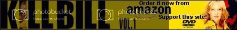
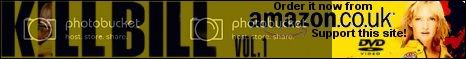
nice one, for co.uk. i like that. not many people order using our co.uk links unfortunately
[quote=“Ify”]
Those Kill Bill, Pulp Fiction and True Romance banners from the-bride look fuckin amazing
[/quote]thank you Ify 
new banner …
looks nice.
but there is no problem if you use a co.uk logo, it just has to be a co.uk article then. i recommend the tarantino box set which is only available in the UK for example
[color=Black]Woops sorry i put .co.uk without thinking. Okay,Changed the logo…